Tags
 Continuing my series on using python and matplotlib to generate common plots and figures, today I will be discussing how to make histograms, a plot type used to show the frequency across a continuous or discrete variable. Histograms are useful in any case where you need to examine the statistical distribution over a variable in some sample, like the brightness of radio galaxies, or the distance of quasars.
What Kind of Data are we talking about?
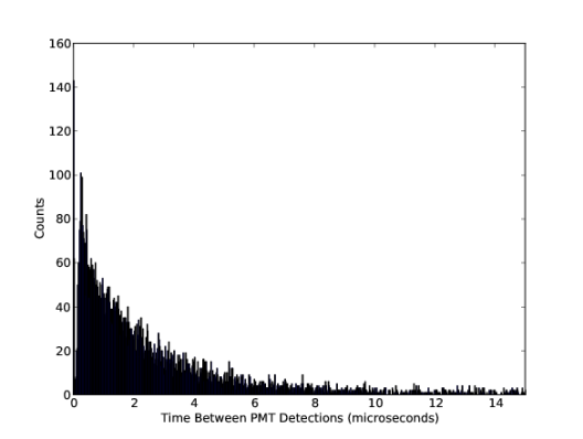
Histograms are useful for plotting the distribution of numbers across a range of possible values. It works by taking a list of numbers, binning those numbers within a number of ranges, and counting the number of occurrences in each bin. I’ve used histograms at least once a week for my research, as they are fantastic tools for comparing populations, checking theoretical distributions against observed data, and countless other tasks. I used the histogram shown below to determine the velocity of cosmic ray muons due to time dilation of their decay lifetimes for one of my senior labs in my undergrad. Histograms answers simultaneously the questions “how many?” and “where?”.
Getting Started with a simple example
In order to make a histogram, we need obviously need some data. Rather than make canned data manually, like in the last section, we are going to use the power of the Numpy python numerical library. If you don’t have Numpy installed, and run a Debian based distribution, just fire up the following command to install it on your machine:
sudo apt-get install python-numpy
What we will use for our data is 1000 random numbers, drawn from a Gaussian distribution. This is the common “normal” distribution, or the “bell curve” that occurs so frequently in nature. We will use a Gaussian centred about zero, with a standard deviation of 1.0 (this is the default for numpy.random.normal):
from numpy.random import normal
gaussian_numbers = normal(size=1000)
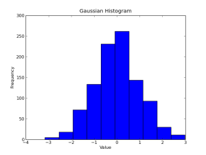
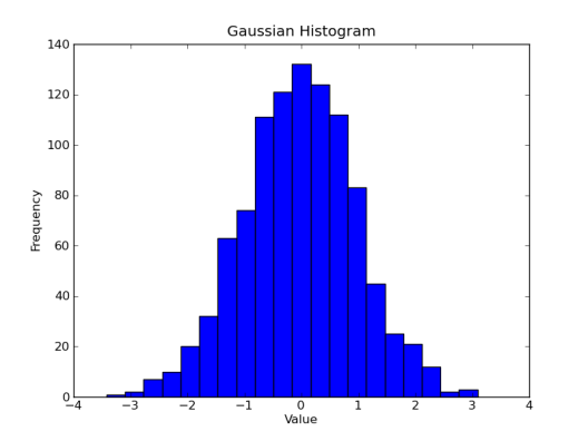
Now that we have something to plot, let’s do it! The pyplot.hist() method is used for generating histograms, and will automatically select the appropriate range to bin our data. With axis labels, a title, and the show() method, our code will look like this:
import matplotlib.pyplot as plt
from numpy.random import normal
gaussian_numbers = normal(size=1000)
plt.hist(gaussian_numbers)
plt.title("Gaussian Histogram")
plt.xlabel("Value")
plt.ylabel("Frequency")
plt.show()
Matplotlib’s histogram will default to using 10 bins, as the figure below shows.
Formatting & Tweaking Our Histogram
We have 1000 points, so 10 bins is a bit small, and makes our histogram look pretty blocky. Let’s up the resolution by forcing matplotlib to use 20 bins instead.
plt.hist(gaussian_numbers, bins=20)
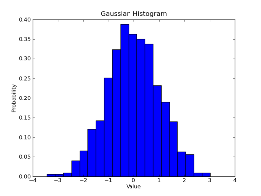
Next, let’s try plotting things as a probability distribution instead of just frequency counts. This will let have matplotlib integrate the total area of the histogram (this is just the total number in the array we feed matplotlib), and scale the values appropriately so that rather than showing how many numbers in each bin, we instead have a probability of finding a number in that bin. The total area of the histogram in this curve will be 1.
plt.hist(gaussian_numbers, bins=20, normed=True)
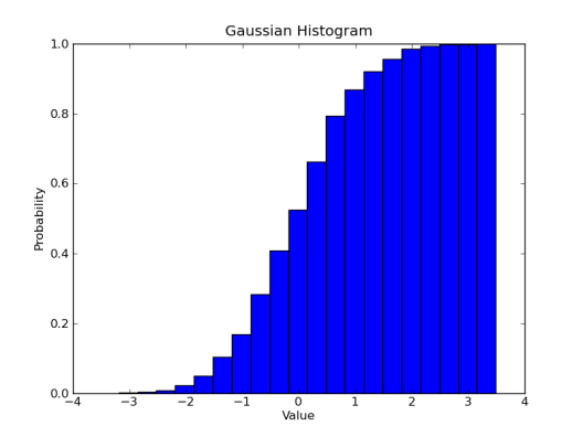
Another task we might want to do is plot a cumulative distribution function. This shows the probability of finding a number in a bin or any lower bin. Making this is as simple as throwing a single argument flag to hist(), just like making a probability distribution.
plt.hist(gaussian_numbers, bins=20, normed=True, cumulative=True)
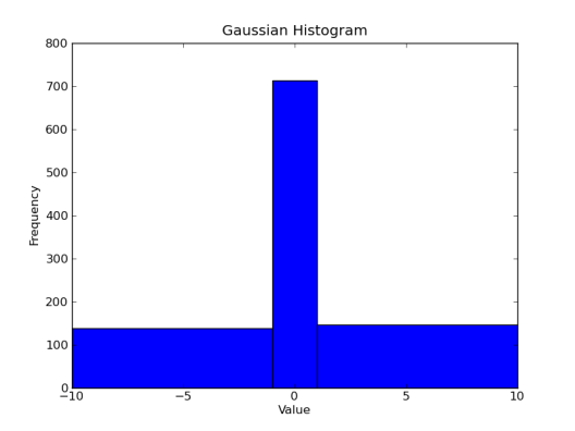
Matplotlib will automatically compute appropriate bins for us, but often we need to know where our bins begin and end. Matplotlib allows us to pass a sequence of values defining the edges of our bins. Let’s see how many numbers are between -10 and -1, between -1 and 1, and between 1 and 10.
plt.hist(gaussian_numbers, bins=(-10,-1,1,10))
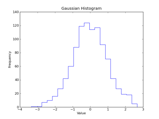
You also might want to change the look of the histogram. Let’s to plot an unfilled, stepped line rather than filled bars. I personally prefer the ‘stepfilled’ option for histtype, as it removes the ugly black lines between the bins. Those lines can get rather crowded if you have more than a few hundred bins, and end up really wrecking the look of your plot.
plt.hist(gaussian_numbers, bins=20, histtype='step')
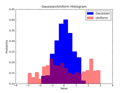
 Like a line plot, we can also plot two sets of values on the same axis with a histogram. In this case though, the plots will obscure each other if the histogram is filled. We can fix this problem easily using matplotlib’s ability to handle alpha transparency. Let’s make a histogram of uniformly distributed random numbers from -3 to 3 in red with 50% transparency over top the blue Gaussian.
import matplotlib.pyplot as plt
from numpy.random import normal, uniform
gaussian_numbers = normal(size=1000)
uniform_numbers = uniform(low=-3, high=3, size=1000)
plt.hist(gaussian_numbers, bins=20, histtype='stepfilled', normed=True, color='b', label='Gaussian')
plt.hist(uniform_numbers, bins=20, histtype='stepfilled', normed=True, color='r', alpha=0.5, label='Uniform')
plt.title("Gaussian/Uniform Histogram")
plt.xlabel("Value")
plt.ylabel("Probability")
plt.legend()
plt.show()
Well, there you have it. You should be able to go out and make your own histograms using matplotlib, python, and numpy. In the next post, I will introduce you to the power of matplotlib’s figure().
Basic Data Plotting With Matplotlib
Part 2: Lines, Points & Formatting
Part 4: Multiple Plots (Coming Soon)
Part 5: ?


Pingback: Basic Data Plotting with Matplotlib Part 2: Lines, Points & Formatting « Bespoke Blog
Pingback: Basic Data Plotting with Matplotlib Part 1: Introduction « Bespoke Blog
This was a one of the nicest intros to matplotlib histo plotting i found on the web — thx, and hope you guys keep it up!
-XTG
(cosmology postdoc)
I need to draw a histogram for some data I have stored in a file. Can’t figure or find on the web a way to do it though. Can you help me?
Same as xylem, enjoyed this histo tutorial
Reblogged this on umek chatter b201crew.
Definitely, a great introduction to matplotlib and histogram plotting. Great work! I’ll be waiting for the next post 🙂
Great post, the best introduction for matplotlib and histogram plotting. I’ll be waiting for the next post in this series 🙂
Hey really looking forward to part 4: Multiple plots.
This is very nice! Thanks!
Thanks for this wonderful tutorial
Might be a simple question but for someone just beginning, could you possibly demonstrate how to use data from a txt or csv file rather then generating it? Great read, thank you!
You will need to (1) first read the data and (2) store it in a numpy array. (3) Then use the array as the data.
For example:
#read data from text.txt in someDir/
dataFromFile = open(‘someDir/text.txt’).read()
#save the data into a numpy array. This might not be straight forward and greatly depends on the nature of your data. In this example I assume the data is merely numbers seperated by commas
import numpy as np
myNumpyArray = np.array(dataFromFile.split(”, ))
#Now you can use the myNumpyArray for the plots following the good examples shown at the top of this page.
Awesome! Thank you. I am doing some protein simulations and am trying to convince the post-doc I work under that python is just as versatile as gnuplot.
Nice post! Here are the same histograms made with Python in Plotly: https://plot.ly/~jackp/639
I was sad to see you never did the other post 😦 Anyway you might be encouraged to complete this series going?
So clear, so illustrative ! Please, please , please continue and complete the series to cover all topics. I am highly obliged even for this much…
Reblogged this on Um Panda na Garagem.
Pingback: Basic Data Plotting with Matplotlib Part 3: Histograms | duarthiago's logbook
Awesome tutorial, thank u ^.^
Hey this was really helpful thank you! All I wanted was a simple template for how to do a very basic histogram plot and you answered my call! The basics of how this part of the package works makes perfect sense now after using your example and having a wee tinker.
Reblogged this on zanderdai and commented:
Useful Technique